FOCUS: DIGITAL EXPERIENCE DESIGN
ROLE: INTERACTION DESIGN LEAD
ACTIVITIES: RESEARCH, UI/UX DESIGN, PROTOTYPING, USER TESTING
How can we make it just a tad bit less confusing?
Cigna is one of the major health insurance providers in America. Yet, because they have been around for such a long time they carry significant technical debt to their digital customer touchpoints. Competitors such as Oscar Health has carved out a market of digital-savvy consumers and tech-forward services that has forced companies like Cigna to rethink the velocity at which they modernize.
Fixing the basics
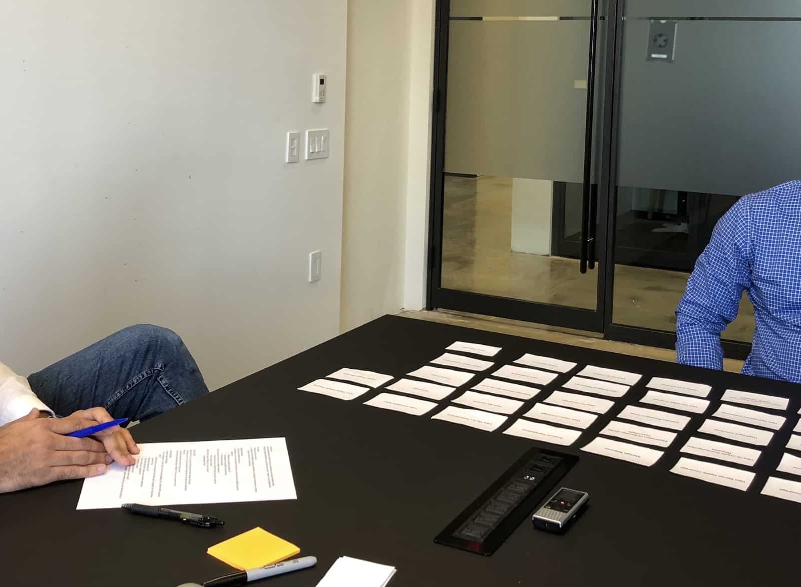
Cigna’s “myCigna” portal is the front door to the digital customer experience and we set out to make it as helpful as possible. We first started with things like the basic navigational structure and informational architecture that would help users find what they were looking for… Most often it was a Doctor or a Prescription. In order to bring resiliency to our design proposal we conducted in-person card sorting sessions and online tree-testing.
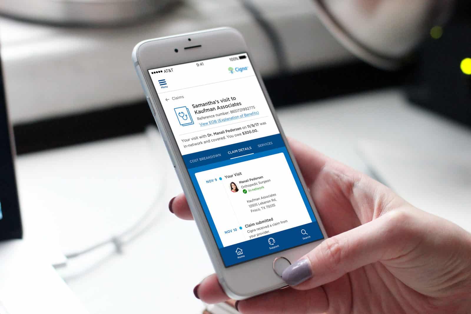
Am I covered?
This seemingly innocuous question was the one thing that folks truly cared about. However, the context is what made the difference. Most people don’t actively prepare for health events, these moments are often followed by the dread of an unexpected bill, not having read the fine print or having gone to the “wrong” doctor. We worked extensively to find small wins that would help bring clarity at critical moments of the customer journey.